Workspaces
Visualizations
Datasets
Basemaps
Profile
Navigation
Navigation elements allow your end-user to toggle the visibility of different sections within a visualization.
Overview
In Mappica, navigation elements allow users to control which sections of a visualization are visible. They guide users through content, keeping the visualization canvas organized and focused.
Navigation elements are highly flexible, enabling seamless transitions between different visual components, explanatory text, or sequential content, supporting a wide range of user experiences.
You can add a Navigation element to your visualization by selecting Insert in the Toolbar and dragging a Navigation element onto the canvas. Alternatively, click the Navigation icon that appears when hovering on an empty Section.
Setup
In the Setup section under the Navigation tab, you can configure the Display Style of the navigation element as buttons, carousel cards, or dropdown menus.
Margin and Alignment options let you control the position of the navigation element within its container.
In the Settings section, you can place a Label above the navigation element. If users will require further information, an informational Tooltip can be placed alongside the label.
You can also set a Default Value, determining which of the buttons, cards, or dropdown menu items is selected when the visualization loads.
Navigation Items and Connections
The Navigation Items section defines the items the end users can select, which could be displayed as individual buttons, carousel cards, or dropdown menu options based on your chosen display style.
In the Connections section, you can link these items to specific sections of the visualization. The user's interaction with these navigation items will control the visibility of connected sections according to the four rules outlined in the next section.
Navigation functionality can be previewed directly on the editor canvas, where hidden sections disappear to replicate the published view. In the Layers tab, hidden sections are displayed in gray text and a "hidden" icon.
Understanding Navigation Logic
To ensure your visualization behaves as intended, it's important to understand how navigation elements control sections in different scenarios. Rules 1 and 2 cover the simplest use cases, while Rules 3 and 4 enable more intricate and flexible navigation setups.
Rule 1: If a section is connected to a single navigation item within a navigation element, the section is shown when that item is selected and hidden when it is not.
This facilitates the simplest use of navigation elements, where each navigation item directly controls the visibility of a single section.
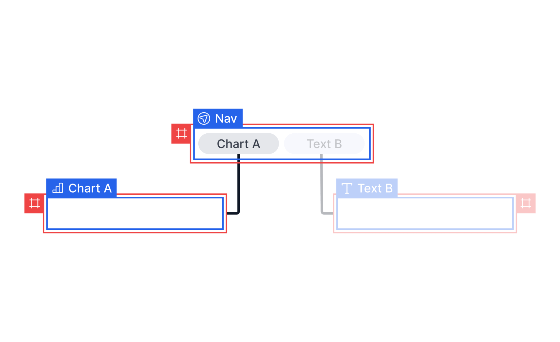
Rule 1 facilitates the simplest use case of navigation elements, where sections connected to the selected navigation item are displayed and sections connected to the unselected navigation item is hidden.
Rule 2: If a section is not linked to any navigation items, it remains visible at all times.
This is useful for elements like headings that should always be displayed. In scenarios where sections are unconnected to navigation items, they remain visible on the canvas.
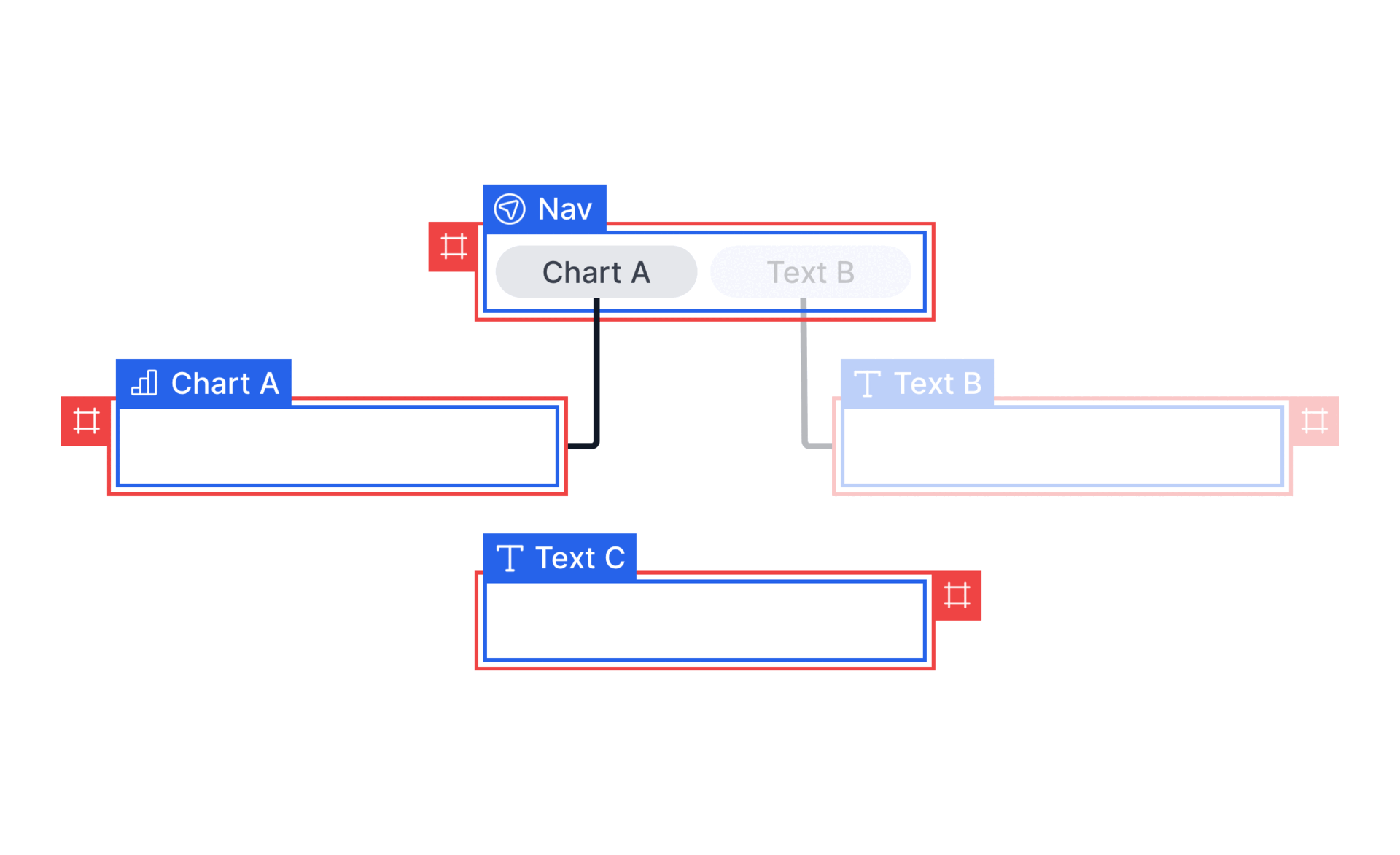
Rule 2 allows sections to remain visible on the canvas when they are not connected to any navigation element.
Rule 3: If a section is linked to multiple navigation items within the same navigation element, the section will be displayed as long as any of the connected items are selected. If none are selected, the section will be hidden.
This rule enables sections to be shared across multiple navigation items, keeping these shared sections visible as long as at least one relevant item is selected.
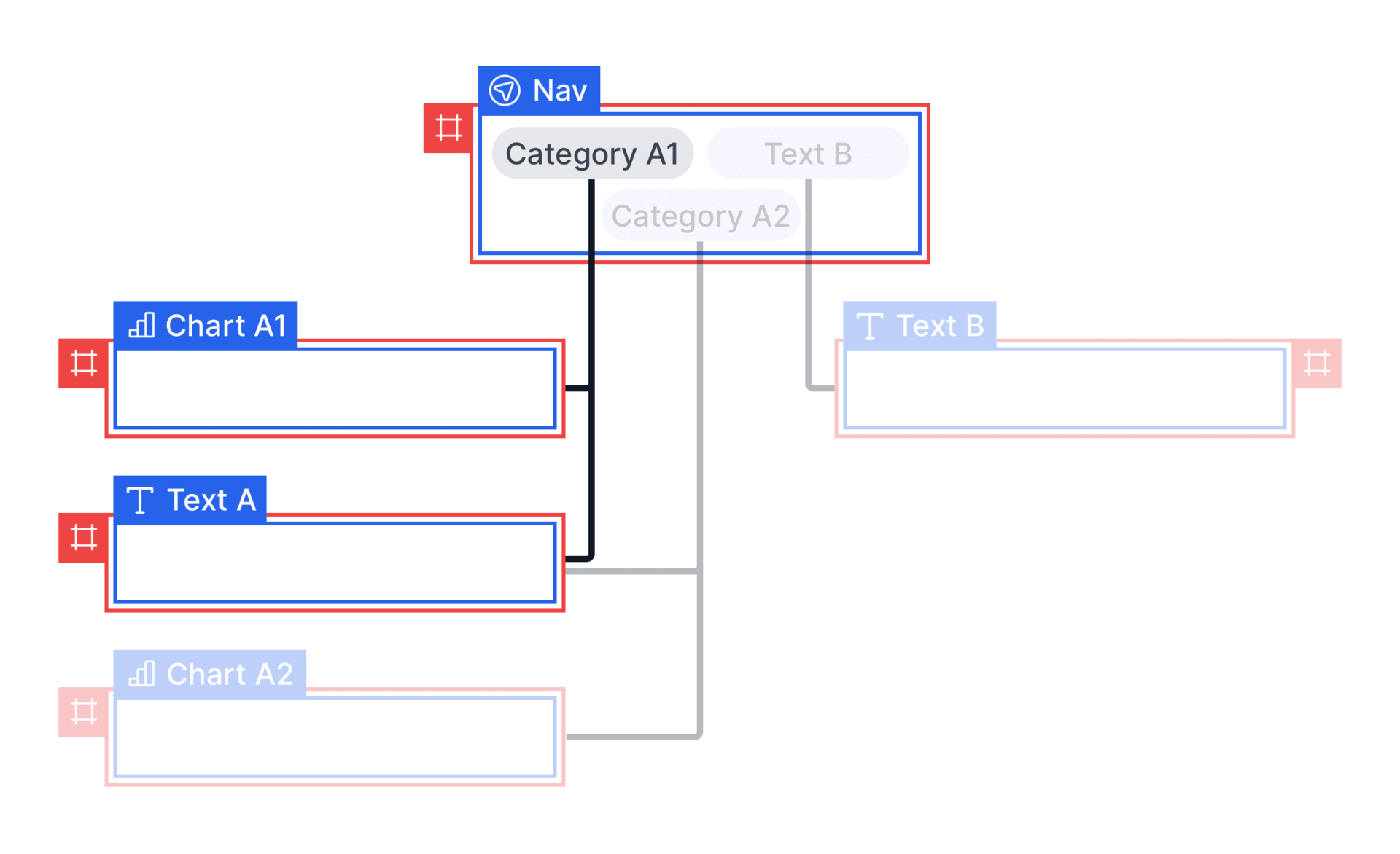
Rule 3 applies to situations where a section is linked to multiple items within a navigation element. The section will be shown if any of the connected items are selected.
Rule 4: If a section is connected to multiple navigation elements, if one navigation element attempts to display a section, but another attempts to hide it, the section will remain hidden.
This rule allows multiple tiers of navigation to be supported. Top-tier selections can be set up to enable or disable groups of sections, and secondary tiers can then manage visibility within those groups. When multiple navigation elements affect the same section, the hidden state will be prioritized if any navigation element attempts to hide the section.
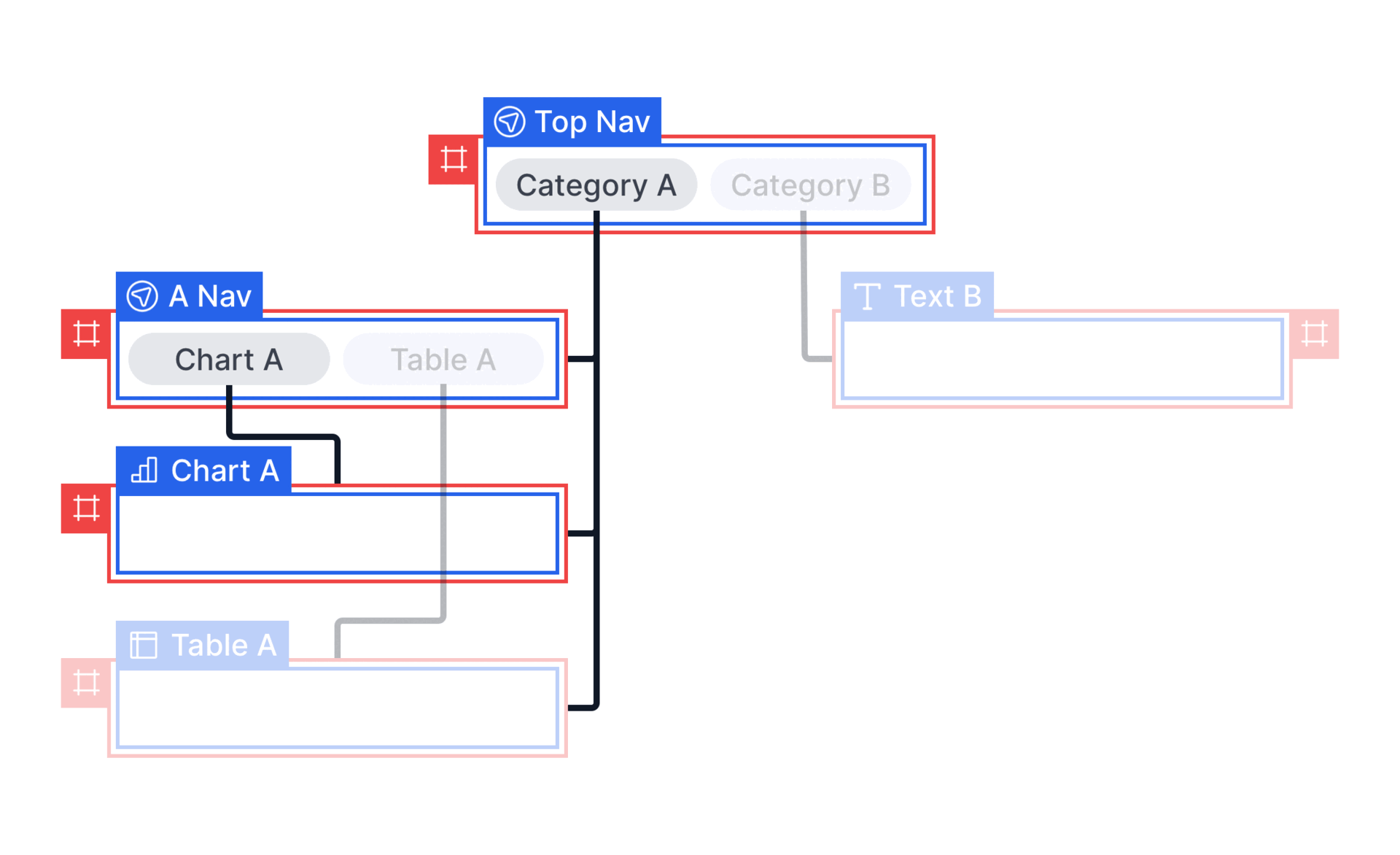
Rule 4 applies to situations where a section is linked to multiple navigation elements. The section will be hidden if it is deselected by any of the navigation elements.
Use multiple navigation elements to create hierarchical navigation systems where top-level navigation controls broad content areas and secondary navigation manages specific sections within those areas.