Workspaces
Visualizations
Datasets
Basemaps
Profile
Charts
Creating Charts
Charts can be created by clicking Insert in the Toolbar and dragging a new chart onto the canvas. You can also click the chart icon in any empty section.
Click on any chart on the canvas to select it. Like other elements, charts are highlighted in blue under the Layers tab once they have been selected.
Once selected, a chart can be customized by selecting the Chart tab on the right of the page, where the following functionality is available:
Setup
In the Setup section, under the Chart tab, you can assign the following properties:
- The name will be used to reference it in the Layers tab and on the canvas.
- The top, right, bottom, and left Margin that will be added between the chart axes and the edge of the chart container.
Because the margin sets the space between the chart axes and the edge of the container, ensure you add enough margin for any axis ticks or labels. If needed, use options in the Axes section such as Limit Tick Width, Limit Tick Characters, and Rotate Ticks to constrain the size of tick and label text.
- The Size Ratio of the chart container. Since the chart will always take up the available width inside its parent section, the size ratio effectively determines the chart's height.
- Optionally, the chart's Minimum Height and/or Maximum Height. If the height calculated by the size ratio is smaller than the Minimum Height or larger than the Maximum Height, then the Minimum Height or Maximum Height is used instead of the size ratio.
Chart Types
In the Chart Type section, you can select from the following options. Use the links to read documentation for each chart type.
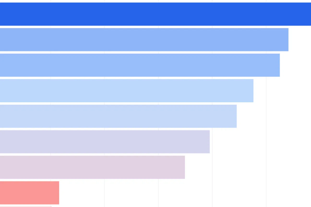
Column and Bar Charts
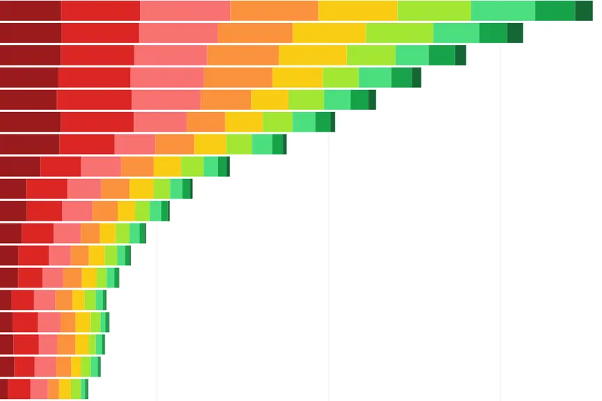
Stacked Columns and Bars
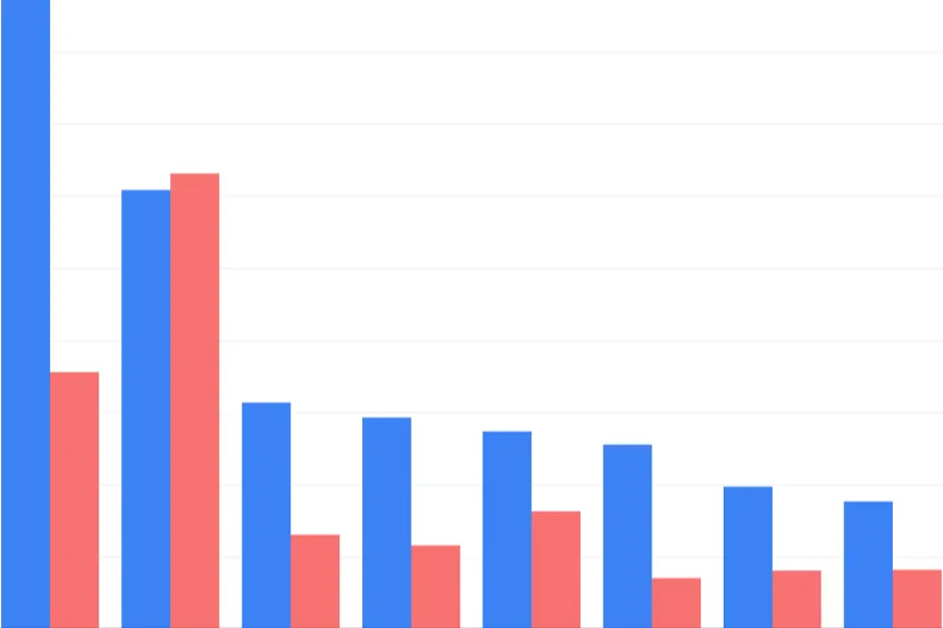
Grouped Columns and Bars
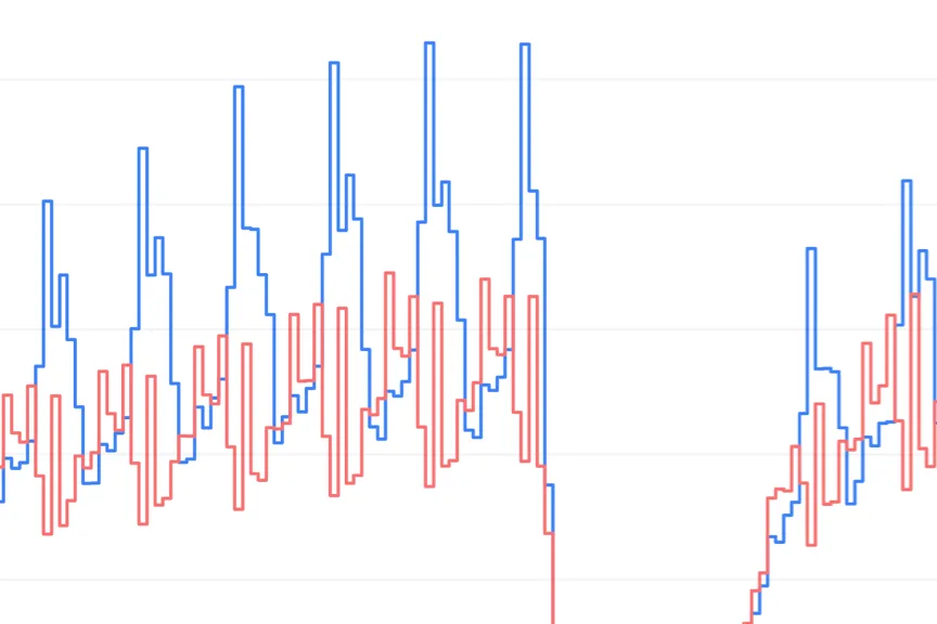
Line Charts
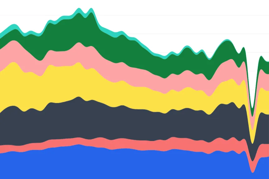
Area Charts
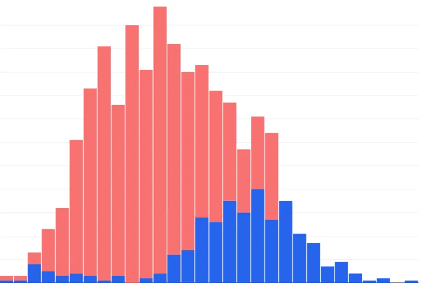
Histograms
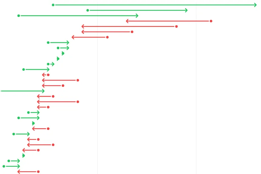
Arrow Plots
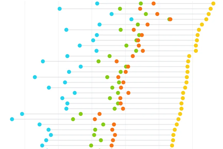
Dot Plots
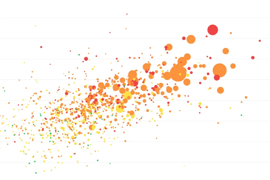
Scatter Plots
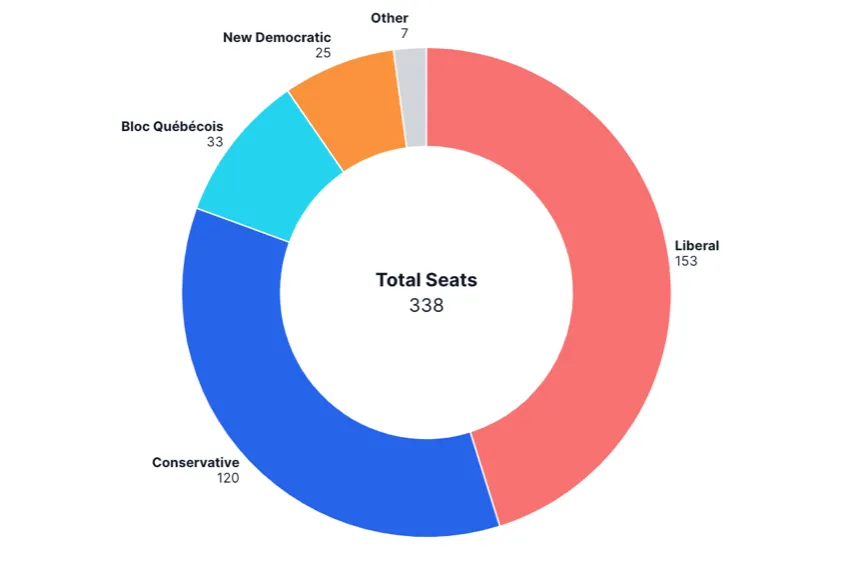
Pie and Donut Charts
Connecting to Datasets
In the Dataset section, you can select the dataset for your chart element, which contains the data that you wish to display on the chart. In order to add a dataset to a chart element, you must first add a dataset to your project. This can be done by selecting New Dataset in the Project tab.
If you are on the Pro plan, you can upload your own files (in csv format) to use as datasets, by clicking New Dataset and then Upload Dataset.
After you have selected a dataset, you can optionally enable the Prefilter Dataset switch, which lets you filter the data that is supplied to the chart. The filter is a "prefilter" because it is applied before the visualization is generated; end users are unable to adjust the filter dynamically.
Next, the Data Format is displayed. In most Mappica charts, you can select either Wide Data or Long Data, though in some charts only one option is available. The data format should reflect the structure of the selected dataset. It also determines the fields that will need to be set for the chart.
Finally, choose the Fields that should be used to construct the chart. The exact fields that will need to be specified depend on the selected chart type and whether wide data or long data is selected. More detailed information is included in the pages for each chart type, linked to in the Chart Types section.
Connecting to Filters
You can establish connections to filter elements under the Chart tab, in the Connections section, by making a selection under Filter.
A Filter element can be styled as a series of checkboxes, a dropdown menu, or a slider. Values from the specified Filter Field appear as individual checkboxes, dropdown menu items, or (for numeric filtering) slider values. A given chart can be connected to one or more filters, and the same filter can be connected to multiple charts or other elements.
When a filter element is connected to a chart, it dynamically controls the dataset records displayed in the chart based on the user's selections. Filters can also adjust the chart's axis range dynamically, provided the Minimum and Maximum Range values of the axis are set to auto. For example, in the case below, a slider filter is connected to the same dataset field as the chart's vertical axis. As the user adjusts the slider, data points are added or removed from the chart, and the vertical axis shifts accordingly.
If your chart uses Wide Data format, use a Selector element instead of a filter to dynamically control the chart color series.
Typically, the Filter element you connect to will use the same Dataset as the chart element. However, this is not strictly necessary. If the filter and chart elements use different datasets, the filter will only affect the chart if the chart's dataset contains a field (column) with the same name as the Filter Field in the filter element. In this case, the values in these fields must at least partially align for the filter to take effect. Any non-matching values between the fields will be ignored during filtering.
Connecting to Selectors
If you are building a chart using Wide Data format, you can establish a connection to a selector element under the Chart tab, in the Connections section, by making a selection under Selector.
Selector elements control which series fields are displayed in connected elements that use a wide data format. Selectors can be displayed as checkboxes, dropdowns, or legends. While a chart can be connected to only one selector, a single selector can be connected to multiple charts and other elements that use series fields. Once connected, the selector element dynamically controls the dataset fields (columns) passed to the chart as series fields based on user selections.
Sorting
In the Sorting section under the Chart tab, you can control how data is ordered in your chart. Different chart types offer various sorting options:
Independent Axis Sorting
For charts with categorical data on the horizontal axis, you can sort by:
- Field Order: Maintain the original order from your dataset
- Alphabetical: Sort categories alphabetically (A-Z or Z-A)
- By Value: Sort categories based on their corresponding values (ascending or descending)
Series Sorting
For charts displaying multiple data series, you can control the order in which series appear in legends and stacked elements.
Axes
The Axes section under the Chart tab allows you to customize the appearance and behavior of your chart's horizontal and vertical axes.
Axis Range
- Minimum and Maximum: Set custom range limits or use auto for dynamic scaling
- Include Zero: Force the axis to start from zero for better visual context
Axis Labels and Formatting
- Axis Title: Add descriptive titles to your axes
- Show Axis Line: Toggle the visibility of axis lines
- Show Grid Lines: Display grid lines for easier value reading
- Tick Density: Control how many tick marks appear on the axis
Text Formatting Options
- Limit Tick Width: Set maximum width for tick labels to prevent overlap
- Limit Tick Characters: Truncate long labels with ellipses after a specified character count
- Rotate Ticks: Rotate horizontal axis labels (0°, 30°, 45°, 60°, or 90°)
- Use Short Format: Display large numbers in compact format (1K, 1M, etc.)
Additional Features
- Add Pagination: Split chart data into manageable pages with navigation controls
- Clip Chart: Restrict chart elements from extending beyond container boundaries
Colors
Color formatting, defined in the Colors section under the Chart tab, is specific to the selected Chart Type and Data Format.
For charts that use Wide Data format, separate colors can be assigned to each of the selected series.
For charts that use Long Data format, you can specify a Color Field, which can be a text field or numeric (number, currency, percent, or measurement) field from the selected dataset. If you select a text field, each unique value in that field will be treated as a category and can be assigned a color. For numeric fields, you can configure a Color Gradient, Domain Minimum and Maximum, and Color Scale.
For certain chart types where using distinct color series is not essential, a Fixed color formatting option is available alongside the Variable formatting options described above. The option applies a single color to all chart elements and is supported for bar charts, column charts, arrow plots, and scatter plots.
Settings
A Settings section under the Chart tab is available for Line Charts, Area Charts, Dot Plots, Arrow Plots, Histograms, and Pie and Donut Charts. Settings options vary depending on the selected chart type; these options are listed on each individual chart page.
Bar Fields
In dot plots, it is possible to toggle on Add Bar Fields, which draws bars between a Start Field and an End Field. When this feature is enabled, you can also select a Bar Color, Bar Width, Bar Start Symbol, and Bar End Symbol.
Range Fields
In line charts, it is possible to toggle on Add Range Fields, which draws ranges between two points (a "High value" and a "Low value") and associates each range with a line series on the chart. This is typically used to add visual context to the variability or uncertainty associated with a particular data series, through statistical measures such as confidence intervals and prediction intervals.
The range field is always assigned the color of the line series that it is associated with. You can choose the Opacity of the shaded ranges on the chart (with the default set to 30%).
Wide Data Format
If the line chart uses Wide Data format, you will need to specify separate dataset fields (columns) for the high and low range values for each line series. For example, assuming series "A" and "B" are added as lines in the dataset, you will need to select columns "A High" and "A Low" and associate them with series "A"; you will then need to select columns "B High" and "B Low" and associate them with series "B".
Long Data Format
If the line chart uses Long Data format, you only need to specify one high column and one low column for all series. Next, confirm the line series that should be assigned a range.
Annotations
In the Annotations section under the Chart tab, you can add various helpful annotations to a chart. The options vary by chart type:
Bar and Column Chart Annotations
Display Bar Totals: Display the value of each bar directly on the chart. By default, annotations appear inside the bars, but you can select Total Outside Bars to place them outside. Use the Hidden Annotation Values setting to hide annotations for bars with values within a specified range.
Stacked Chart Annotations
Add Data Point: Add a dot annotation to represent a calculated value based on all items in a stack. Choose the Data Point Operation to calculate the "Sum," "Average," or "Median" of the stack's values. Apply a color to the dot using the Data Point Color setting.
Line and Area Chart Annotations
Annotations can be added by clicking the Add Annotation button. The position of each annotation is specified with the "X Location" and "Y Location" fields. If the chart's horizontal axis uses a date field, you can specify the X location in YYYY/MM/DD or YYYY format.
The following items can be added to each annotation:
- Add Text: Add text to the annotation using the Text field. Choose a Color for the text, and specify its position relative to the X and Y locations using the Text Position setting.
- Add Line: Add a line annotation to your chart. Use the Direction setting to render either a "Horizontal" line, a "Vertical" line, or line in both directions ("Both").
- Add Symbol: Add a symbol annotation to your chart. Select the symbol type from the Symbol dropdown, which includes options such as "Asterisk," "Circle," "Cross," "Diamond," "Hexagon," "Plus," "Square," "Star," "Times," and "Triangle."
Histogram Annotations
Add Data Line: Add a dashed line annotation to represent a calculated value based on items in a histogram series. Choose the Data Line Operation to calculate the "Average" or "Median" of the histogram values. The data line will automatically be included in any legend connected to the histogram.
Tooltips
Tooltips can be enabled by selecting the Chart tab, navigating to the Tooltip section, and selecting Display Tooltip. These are automatically configured to display the fields selected in the chart.